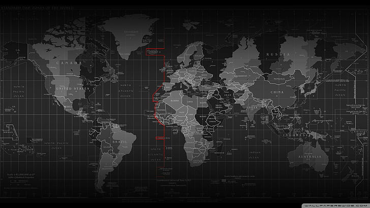
I estimate that more than 75% of all data issues relate, in some way, to issues with date and time. Time zones play a crucial role in our globalized world,…
Starting Wide: Why it’s Important to Begin Data Analysis with a Broad Overview
In the world of data analysis, starting wide and gradually focusing in on specifics is a crucial step towards arriving at accurate and insightful conclusions. While it may be tempting…
Data Observability: Monte Carlo : Use Cases
So, the POC is in full swing and I have to say, even without the use cases we are pretty sold on the platform. We came in with a problem…
Expanding APIs with Knowledge Graphs
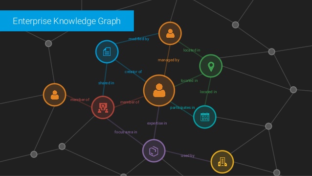
You can expand your apis with suggested information the user might not know. Knowledge graphs are the key.
5 things every visualization should have
I cringe when I see beautiful maps, charts and graphs that provide no value. For a truly valuable visualization, you need to make sure you account for the aspects that…
Conquering Analytics: Collection, Validation, Enhancement, Accessibility
In the SaaS world, analytics powers existing development and should determine the next steps in the path for the future of products and services. So if I asked the question,…
User Experience: Creating Stakeholder Maps
When it comes to user experience, a product manager should always understand who the stakeholders are for their product. It is very common to do stakeholder interviews and get detailed…
Analytic Dashboards: User Experience and Cues
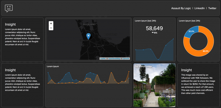
A great dashboard creates more questions than it answers. It pushes business decisions into new directions and helps to validate previous work. So, what makes a good user experience when…
Analytic Dashboards: When to use a scatterplot.
I get many questions about how and when to use certain types of visualizations. Scatterplots are a unique and powerful tool to visualize data and when used correctly, can identify…
The Anatomy of Good Visualization
What makes for a good visualization? There are a number of components that are necessary for a visualization to be valuable. Just having a line (series item) represent some segment…
