A great dashboard creates more questions than it answers. It pushes business decisions into new directions and helps to validate previous work. So, what makes a good user experience when…
Items should be interchangeable.
Analytic Dashboards: User Experience and Cues
-
- 3 min
A great dashboard creates more questions than it answers. It pushes business decisions into new directions and helps to validate previous work. So, what makes a good user experience when building analytic dashboards? There are a number of ways you can ensure that your users are taken care of and get what they need. The truth about building the right dashboards is not what you do well, but making sure you don’t make the common mistakes that usually destroy the purpose of the application.
Who is the Audience?
Before you do anything, you must understand who you are trying to give information to. A brand manager has different needs than a marketing manager. The same is true for the average associate of a company in contrast to the CMO. A single interface, if built correctly, could engage all of these types of users but would probably dilute the functionality.
Key: Before you design anything, know who the users are. Put yourself in the position of the stakeholder and ask the key questions that will help them be more productive and make good business decisions. Interview the people who will be using the application and find out what they need.
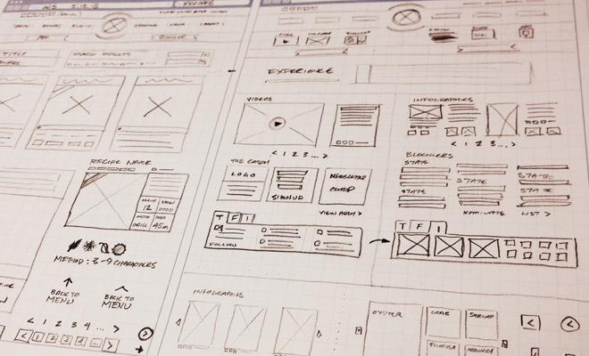
Wireframes are essential.
Many people design dashboards and spend countless hours in development changing and iterating over things but if they would have spent some of that time at the beginning wireframing out the functionality, most of that could have been avoided. A good wireframe not only sets the tone for the layout but also helps the developers to understand functionality, cutting down on questions during development. The best wireframes are simple and do not have graphical components so the team can focus on functionality without content and design.
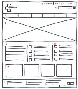
My personal favorite is building “functional wireframes”. For UX designers with HTML skills, you can build functional pages or app screens in live code to help developers better understand the functionality. Adding in demo scripts is also a nice touch. An easy one to add in is Bootstrap Tour.
Design to Technology
The biggest mistake that is usually made in developing analytic dashboards and reports is design that doesn’t take into account the capabilities of the technology. As a designer, look at the functionality of the wireframes, communicate with the developers to determine which charting and visualization components are suggested. If a development team wants to use Kendo, D3 or ChartJS for visualizations, go to the respective website and look at what the charts have out of the box. Start a dialogue with developers if you want to do something that isn’t in the norm, visually.
The biggest delays and troubles in development come from visualization customization.
I know this goes against the principles of design but a good designer should always attempt to provide maximum business value. A discussion with developers may surprise you of what is possible. It is more about putting guard rails up than preventing good design.
A designer should also not choose the visualization styles unless they have the necessary UX training of how and when to use certain visualizations. Ideally, a report or dashboard design should contain interchangeable elements.

Ask yourself this question: If you are showing twitter engagement over time, what is the most useful way to display it to visualize that information. Should you use comparison metrics (week over week, etc), should you show it by campaign, or do you need the content of the engagement? If you cannot answer these questions, don’t design it. Bring in a user experience professional as well as an analyst to help define these requirements.
An analytic dashboard or report is only as good as the information it provides and if you guess, you will guess wrong.
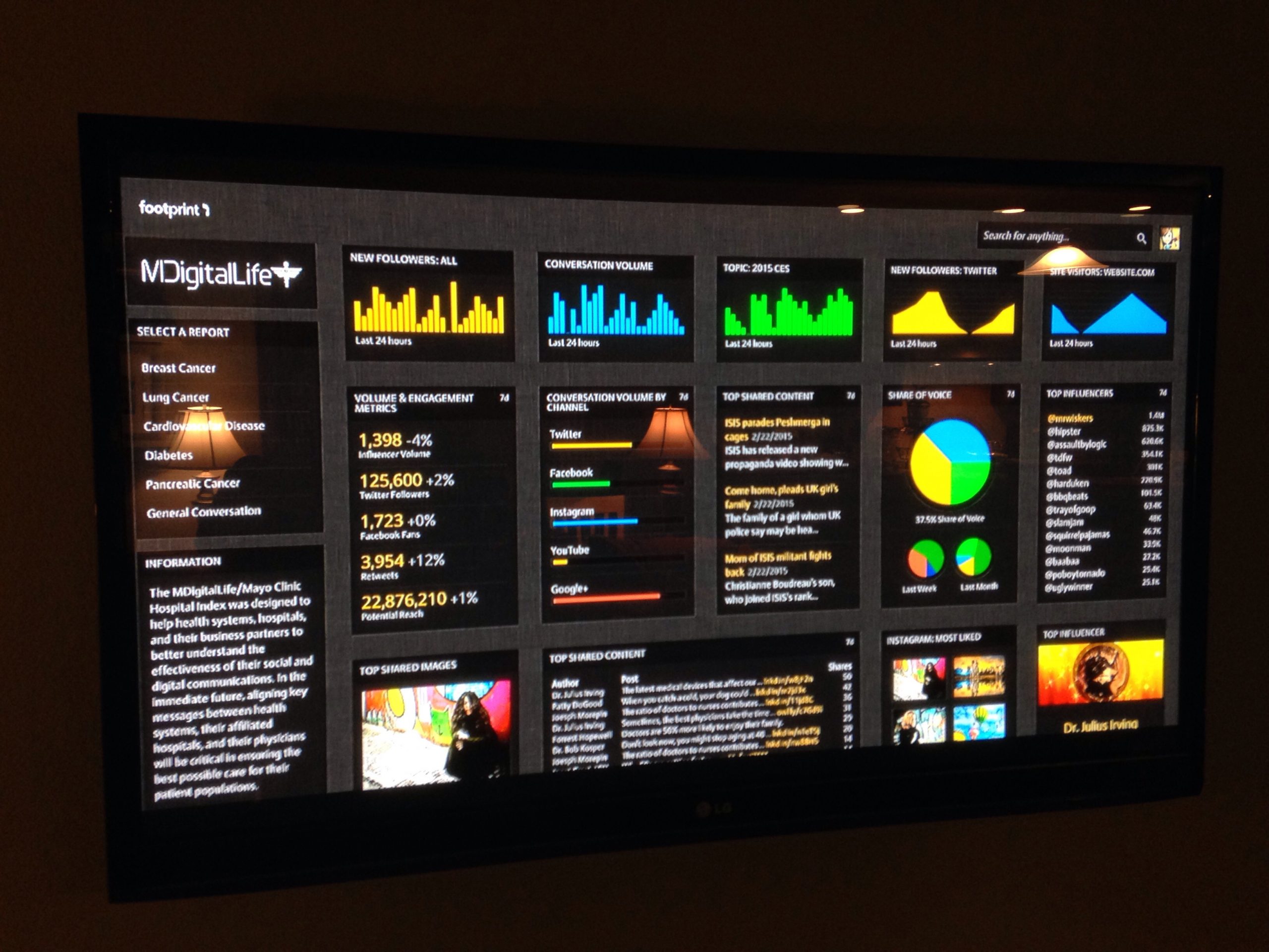
Visual Cues
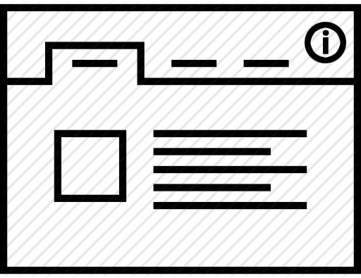
Having visual cues is a great way to help users to understand the information they are looking at. You cannot assume anything. Users vary. The familiarity of certain terms or concepts also varies and you want your visualizations to be as self descriptive as possible. Adding in “information icons” or functionality like the Bootstrap Tour script mentioned above is a great way to help guide users. You should also make use of hover states to inform users of basic details.
Analytics
Analytics must be installed before releasing anything. Collect measurements on usage and understand what is and is not working. Iterate on the application and verify performance. If certain items are not being used, understand why and if they aren’t needed, phase them out in favor of new requests. Analytics will help you determine the future of the application. Google Analytics is easy to install and you should learn how to use event tracking, not just page tracking.
—————————–
I’ve been developing consumer dashboards and analytic infrastructure for clients like Verizon Wireless, HP, Intel, and RedBull. If you have any questions or want to talk visualizations, hit me up on Twitter (@assaultbylogic) or via email (john@slingspace.com).