What makes for a good visualization? There are a number of components that are necessary for a visualization to be valuable. Just having a line (series item) represent some segment…
The Anatomy of Good Visualization
-
- 3 min
What makes for a good visualization? There are a number of components that are necessary for a visualization to be valuable. Just having a line (series item) represent some segment of data (y-axis) over time (x-axis) isn’t enough.
For a data visualization to be relevant you need two main things, context and reference. The more efficient you can make the interface to provide those things, the more usable and appealing the visualization is.
Context
In order to understand what the data represents, you have to provide your users a focus and then surround it with the appropriate amount of context. Usually referred to as “focus plus context”, the basic idea with focus–plus–context–visualizations is to enable viewers to see the object of primary interest presented in full detail while at the same time getting a overview–impression of all the surrounding information — or context — available (http://www.infovis-wiki.net/index.php/Focus-plus-Context).
The basic idea with focus–plus–context–visualizations is to enable viewers to see the object of primary interest presented in full detail while at the same time getting a overview–impression of all the surrounding information — or context — available.
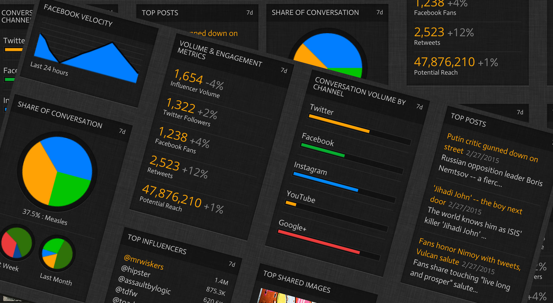
If you slap a line or pie chart down in front of a user, with no context, it may have little to no value for them. For example, say I give a user a line chart of the number of users mentioning them on Twitter. What is the value of that data with no context? To provide context for that content, here is a short list of things we can do, including but not limited to:
- Legends
- Information cards
- Titles
- Axis line descriptions
- Time Frame
Reference
Most important is reference. Reference is the relationship between two objects in which one object describes a connection, or link to another object. The first object in this relation is said to refer to the second object. I consider this essential to context as well. Let us go through a few of the more important reference items.
Reference is the relationship between two objects in which one object describes a connection, or link to another object.
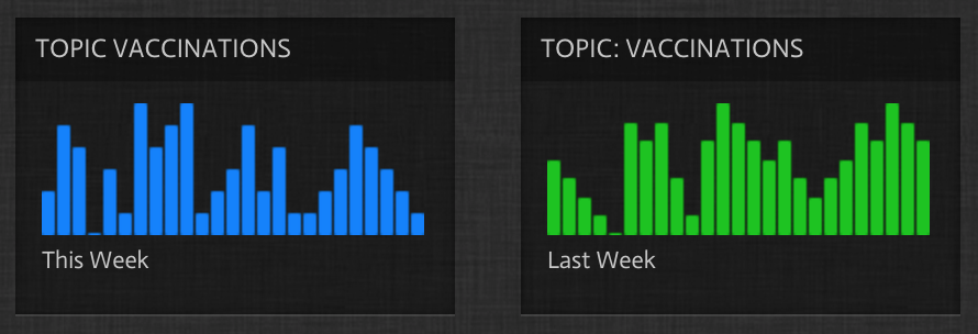
Temporal Reference
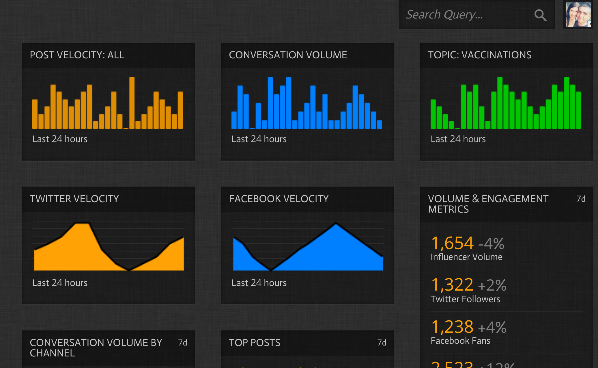
A temporal reference is relating an object or series of objects to their respective points in time. This is generally shown by overlaying the historical time series on top of the existing focal data (1) or showing the same type of visualization, with historical differences, next to the focal visualization (2).
(1)

(2)
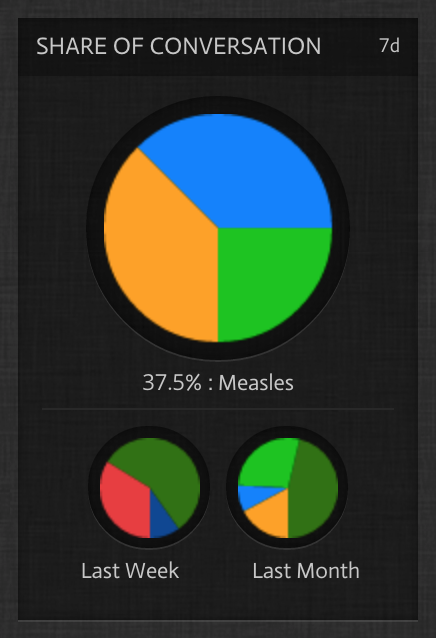
Key Performance Indicator (KPI)
A common reference that is used in visualizations is the Key Performance Indicator, or KPI. KPIs evaluate the success of an organization or of a particular activity in which it engages.
KPIs evaluate the success of an organization or of a particular activity in which it engages.
Any successful business intelligence tools that deliver insights and inform business strategy use KPI layers to serve as benchmarks of success. They also serve as goals in the tools. Having a goal is powerful, it gives users the ability to see progress during the process instead of having to reason that out for themselves.
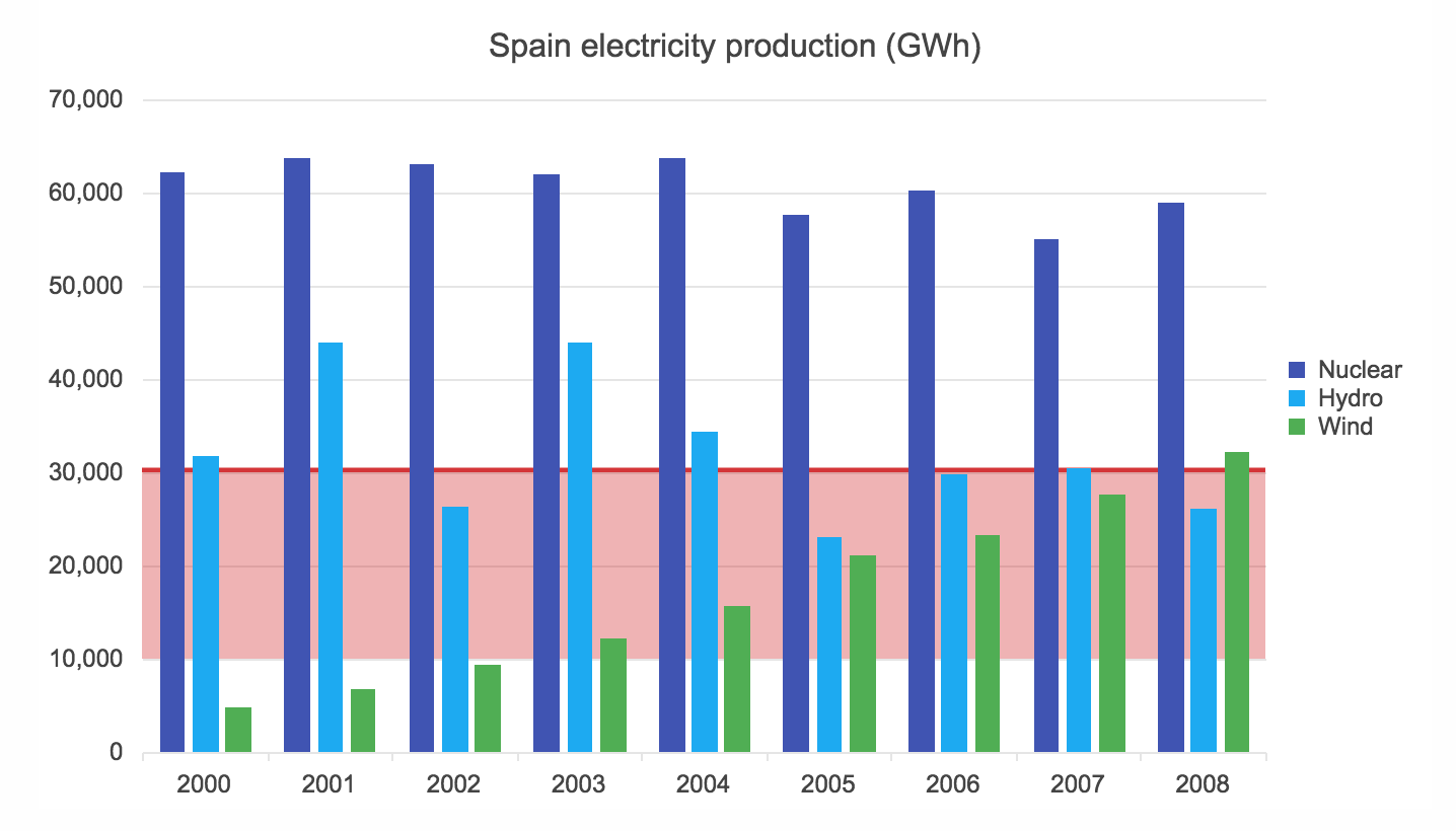
Trendlines and Plot Ranges
As a user of a business intelligence tool, you can use trendlines to show progress over time for key metrics. This will give you insight to predicting behaviors in large data sets.
Plot ranges show high and low threshold values on visualizations that serve to frame optimal data results. You can use those to then activate action plans on values above and below the predetermine values.
These are some of the more important pieces to a successful visualization strategy. A good user experience designer will employ these and other unique strategies to deliver visualizations that educate, inform and create useful insights that make business intelligence tools more valuable in the market place.