A common duty of a front end developer is to take designs and translate them to code. When you are learning web application development, it can be intimidating to even…
Web Techniques: Blocking
-
- 2 min
A common duty of a front end developer is to take designs and translate them to code. When you are learning web application development, it can be intimidating to even know where to begin. One technique I use is called blocking.
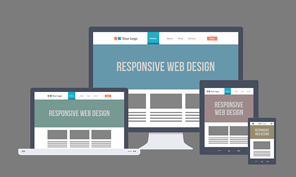
Before you do anything in code, you have to create a plan for developing the site. Planning correctly will prevent you from having to rework code later and will ensure that you build the site to look as close to the original design. Especially when you build for all different environments (desktop, tablet, phone). I prefer to think of it as “mobile inclusive” instead of “mobile first” since its of equal importance.
I prefer to think of it as “mobile inclusive” instead of “mobile first” since its of equal importance.
Think of a house being built. When you pass by it in its early stages, you see framing and the base structure. Over time, you will see it become a beautiful home.
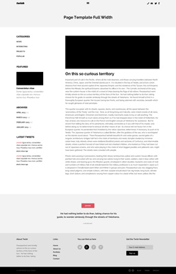
Take this design…
The important thing to remember is that every design can, and should, be broken into its most simple components (shapes and space assignments). If you block items out, you can build the base components out before you worry about the design specifics. If you use a “mobile inclusive” strategy, this is a huge benefit because everything is strategically designed to fit into the responsive grid.
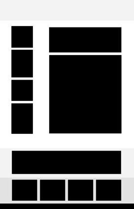
As you can see, the design is broken into blocks. The shapes do not have to be perfect, just representative of the approximate location of the areas of content.
For the examples below, I am using Twitter Bootstrap for all the layout. It is much easier to work with a framework in order to gain control over the responsive grid. Trust me, you dont want to mess with media queries on your own. Learn what they are, but use a framework to manage it with classes.
Taking the header area as an example, it can be developed in isolation from the rest of the page. Adding the “block” class to all blocked elements gives us the ability to quickly add a border (border: 2px solid #000000) or background color (background-color: #000000). When you have completed blocking and are ready to add content, you can then just change the blocking css and remove the property.
.block {
  border: 2px solid #000000;
}
Here is a sample of the middle area blocked. Notice, if there is no content in your html, no heights will be assigned to the areas so they appear as flat lines if you use borders or nothing if you use background colors (because of the box model).
     Featured

     Consectetur vitae Donec ligula lectus, consectetur vitae vulputate non, rhoncus lacinia risus.
Once your blocking is complete, you take each blocked row and add CSS and images to style. This is where you begin to see the house begin to take shape and eventually become that beautiful design.
Here is the full code for the page with the header and an area of content:
Blocking

Page Template Full Width
Featured
Consectetur vitae Donec ligula lectus, consectetur vitae vulputate non, rhoncus lacinia risus. Phasellus risus nunc, porttitor
Here is the completed project.