If you are working, in any capacity, chances are you see and use data visualizations everyday. There is so much data moving around, you have to find a way to…
What I’ve learned About Data Visualization
-
- 3 min
If you are working, in any capacity, chances are you see and use data visualizations everyday. There is so much data moving around, you have to find a way to make sense of it all. Very few users can make sense of raw data and even fewer can see patterns in that. Good visualization layers allow users to comprehend more data in less time. With attention spans getting shorter every year, data scientists and UX architects are challenged with discovering new ways to help users interpret data.
Good visualization layers allow users to comprehend more data in less time.
Big data is getting smaller. Interesting concept. The more data that is collected, the smaller the subgroups of data that need to be analyzed in order to use the data effectively. Data visualizations are used to find the trends or narrow the focus. It is the differentiator in the battle to understand user/group behavior.
First, you should understand who your audience is. Every user type is different, they think differently. If your audience is a group of analysts, your data visualizations will not need as much context and can include more complex pattern recognition. On the other hand, if your audience is not as educated in analytics, you have to use lots of context and groups of visualizations to tell the story. Sometimes I look at it as:
- Analysts define the questions and the visualizations help them answer the questions.
- Non-analysts are looking for the answers but usually dont know the questions. An analyst should help define and coordinate the visualizations in order to build context. That context helps the non-analyst user understand the question.
Data visualizations are not just there to show data to a target user. A visualization is there to tell a story and hopefully inform the user to take a business action. It should be immediately apparent to a user what the patterns are. If you set the context and the target user still has to ask “what does this mean” or “so what” then it is not a useful visualization or set of visualizations.
Tabular Format (Tables)
Use tables when exact figures numbers must be known. Helpful to rank items based on quantities. Do not use when trying to read or extract trends. There are a few things you can do with tables to do this but there are much better ways to handle it.

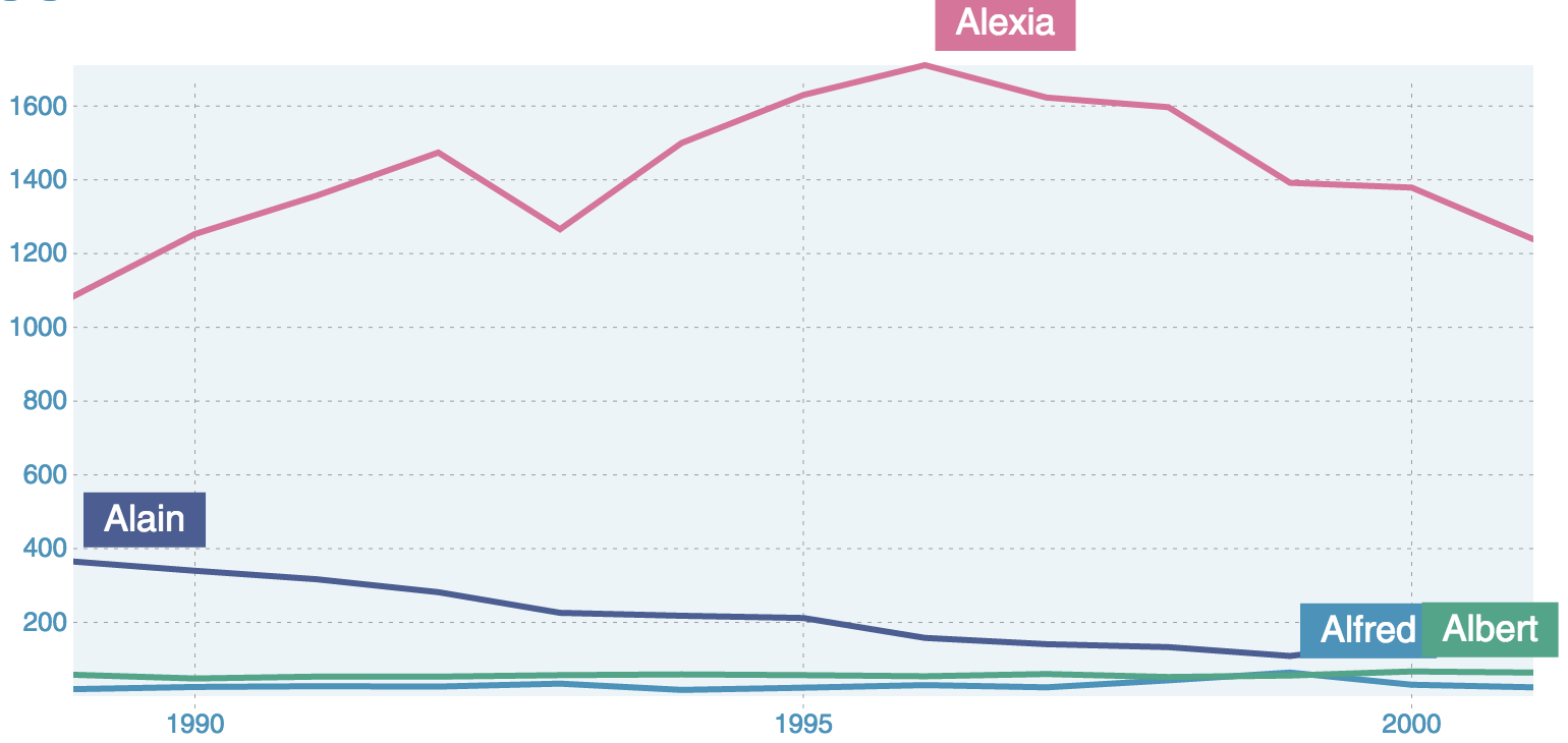
Linear Format (Line Charts)
Use line charts to represent sequential data over time. If you are going to use line charts, use should use some kind of a benchmark. It could be argued that linear data is useless without a reference point. For example, you can compare to the same time range 1 month ago or have a range of values that speak to the average for a given time range.
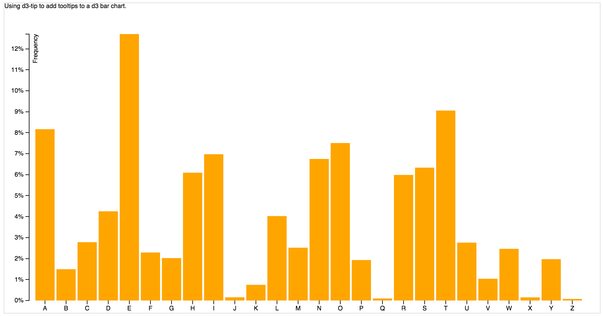
Bar Charts
Use bar charts when you need to show comparisons between categories. If you are looking to show trends, then you should incorporate time into the chart. Bar charts can be effective without benchmarks but should always contain a reference component.
Pie Charts
Pie charts are best used to compare individual share to the whole. It can become difficult to compare the results if there are too many shares. Too many shares make interpretation difficult because the differences between the shares become too thin, making it harder to compare with the whole.

These are the main types but as you go deeper into this subject, you will find that this is just the beginning. You start getting into:
- chloropleth maps
- Aster Plots (Weighted means of a total)
- scatterplots
- zoomable sunburst
- chord diagrams
There are reasons to use each of these and there are literally hundreds more found at d3js.org but setting the context based on user type is key.