I get many questions about how and when to use certain types of visualizations. Scatterplots are a unique and powerful tool to visualize data and when used correctly, can identify…

Analytic Dashboards: When to use a scatterplot.
-
- 2 min
I get many questions about how and when to use certain types of visualizations. Scatterplots are a unique and powerful tool to visualize data and when used correctly, can identify patterns and find trends in even the most complex sets of data. When data points have a relationship to one another, it is called a “correlation”. There are sets of data points that have a negative correlation and sets of data points that have a positive correlation.
Negative Correlation
An example of negative correlation would be measuring time to reach a destination and the distance remaining to reach that destination. Assuming all vehicles traveling had a constant speed. As the time to reach the destination gets shorter, the distance remaining would also get shorter.
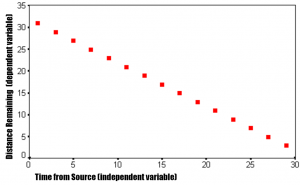
This negative correlation would also be known as a “perfect negative correlation” because there is no variance and the trend is a perfect -1 to -1 match.
Postive Correlation
The reverse is also true for positive correlation. The best example I have heard is that of grades (x) and time spent studying (y). One could hypothesize that as students study more, the better grades that they will get. The scatterplot below shows that to be reasonably true. This is not a “perfect positive correlation” because when dealing with human behavior, there are always exceptions to the rule. Some people don’t have to study as much. You will see these anomalies in the form of “outliers”.
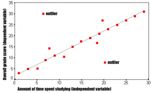
As you can see, using scatterplots for multi-dimensional data is a powerful tool to be able to predict or infer, with relative certainty, the likelihood of a result given a fixed or defined data point. You can also disprove certain theories because scatterplots will also show the absence of correlation or “zero correlation”.
I’ve been developing consumer dashboards and analytic infrastructure for clients like Verizon Wireless, HP, Intel, and RedBull. If you have any questions or want to talk visualizations, hit me up on Twitter (@assaultbylogic) or via email (john@slingspace.com).