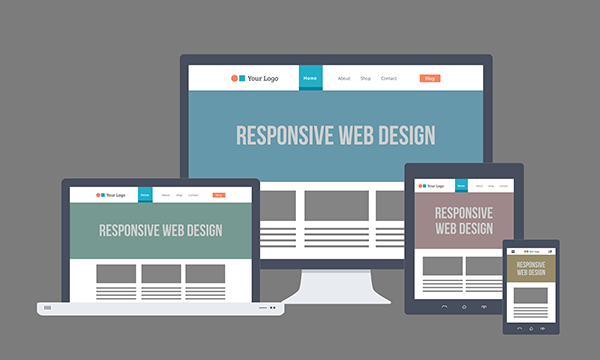
The transition from traditional, single screen web development to the current cross-screen standards that touch on mobile, tablet, the desktop, and beyond, has ramped up significantly in the last few…
Alternative Content in Responsive Design
-
- 5 min
The transition from traditional, single screen web development to the current cross-screen standards that touch on mobile, tablet, the desktop, and beyond, has ramped up significantly in the last few years to a point where almost overnight it has become the de facto approach and standard. In the past, you developed applications and websites by platform. You would have a single experience for the desktop and a single experience for mobile, and that was it. The introduction of tablets into the marketplace created another platform that had to be considered. Luckily, responsive development was already available when tablets became a standard. According to some sources, 122.3 million tablets were being used worldwide in 2012. That number is forecasted to increase to 172.4 million units this year (UPDATE: Actual increase was to 233 million!) and 282.7 million units in 2016. If you are an interactive shop or a development company in the marketing space you have to not only be up to the task but you have to think multiple steps ahead. You have to anticipate the trends and prepare yourself for not only the technical needs but also the business cases for this change. There are many things to consider, and this article will focus on customizing the UX (user experience) and identifying the needs for the changing marketplace.
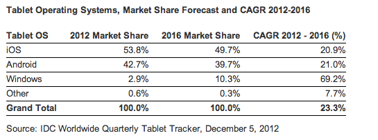
Statistics
When architecting a web application it is important to consider each experience a device is typically designed to support. Think of what your audience is doing when they use each device (the context), not just what they see. The traditional thought is to design a web application technically based on resolution or screen size. Same content, displayed accordingly to fit neatly within a given screen size. Over time, as a UX architect, I realized that this really did not solve the experience per device issue completely nor was it the best solution. I identified that when a user was on a desktop or a laptop, they generally had a different need than if they were on a tablet or smartphone. In the ever-changing landscape of digital screens, we are pushing the limits of traditional development by taking into account HDTVs, 27” and higher displays, and motion activated gaming consoles like Xbox Kinect. Companies should consider current and trending display environments for their applications. By thinking ahead, you prevent yourself from falling behind. Examine the following use cases:
Desktop
Environment: A user on a desktop is typically in an environment where they are sitting down at an office, a café, or a lounge, and have more time for a feature rich application.
Solution: All application content is available providing the best UX elements for the larger interface.
Tablet
Environment: A user on a tablet will need a scaled down experience to fit their environment, which is typically on the couch in front of the TV, in a meeting, or on public transportation. Users on tablets also expect the experience to be more “app like”. This will include standard application type menus, less text, and a more visual interface. Tablet users are transitional mobile users, **more time than smartphone users but generally not as much as desktop users (Note: this is changing rapidly).
Solution: Identify content that is primary and reduce content experiences to fit the environment. Traditional development would reorganize the same content but the better solution is to change content, not just look and feel. When providing a tablet-centered experience in a web browser, an app store link for the full tablet application should be provided as well, if available.
Smartphone
Environment: Smartphone users are mobile. A smartphone users wants quick, bite-sized information such as summaries, contact info, or directions/maps. Use your own experiences to drive this content by industry.
Solution: Use only mobile specific content to drive the experience and leverage mobile device features that wouldn’t otherwise be available on traditional desktop experiences – i.e., camera and file access (in some advanced mobile web browsers), accelerometer, and geo location. The experience should consist of easily consumable, basic information such contact info, summaries, and geo data. You should link to the appropriate app store for the full tablet application, if available.
HDTV, High Resolution & Motion Activated Devices
Environment: Presentation environments are high-contrast, high-resolution displays such as HDTVs or monitors greater than 27 inches (1920×1080). These displays are generally non-interactive environments with the exception of gaming console and some conference displays. Gaming consoles like the Xbox360 from Microsoft have motion activated interfaces like Kinect that can be interfaced and bridged using HTML5 and JavaScript on top of the responsive framework.
Solution: Develop your applications to fill the space. Use only fluid grid responsive layouts that have percentage based breakpoints. Design content that will contract or expand according to the space in which it was designed. Larger environments create greater issues for consistency. Pay close attention to margins, padding and the resolution of background images when CSS3 transforms are concerned (see: background-size:cover; contain).
If developing for a gaming console, examine the usability of the hand as an interface device. Understand the motions that are common to writing on a large whiteboard. Think about what the interface should resemble and what the extra space can be used for. Imagine a large computer desktop and mimic some of the interfaces on many of the newest touch screen devices.
Technical Considerations
In developing these web applications, the latest technology that makes all of this possible without building separate applications is called “responsive design” or “responsive development”. There are lots of different frameworks that incorporate this technology. One of the most popular is called “Bootstrap”, developed by Twitter. It is an open source JavaScript framework that allows web applications to be built on a grid. Essentially, it allows items to span invisible columns on the screen. As the screens change size (from desktop to tablet to smartphone), items expand or contract to fit which ever columns they are set to. If a column cannot fit, it is stacked above or below the previous column. This is the very simple explanation of how the different experiences are created.
I referenced information about not just changing look and feel but also alternative content for each experience. As resolutions change, we use media queries (Adobe has a great article on what they are and how to use them) and built in CSS classes to tell the device to show or hide specific areas of content based on the viewport. The viewport is defined the resolution that is available on the device.
Planning out these different experiences is very important. Here at W2O Digital I have had the pleasure of working with extremely talented designers and developers who work closely together to identify efficient ways of displaying content for each interface, iterating through several rounds of concepts, wireframes, and designs to reach the best possible solution and approach. The designers are very interested in the development side and understand that the UX/UI elements that are available are an integral part of a successful application, while the developers express the same strong interest and appreciation in the design process and pixel perfect execution.
In summary, when diving into a web application or experience, ask the following questions.
- What content will be specific to each type of user that I have? (Smartphone, Tablet, Desktop, and beyond)
How can I organize my content into device-specific use cases? How can I provide an experience that is informative yet simple? - How can I get my designers the information they need to build out the best interfaces for each device? Do they know the proper way to structure wireframes and designs to support a responsive framework?
Start simple and build your experience with each project. Build on that experience and learn with each iteration of development. One thing is for certain, every project should be responsive, no matter how small or large. There is no excuse to still be developing without HTML5 and a responsive framework. In today’s interactive development space, if you aren’t pushing the envelope, considering responsive design as a basic and integral part of a solution and crafting experiences accordingly, you are doing yourself and your clients a disservice. Potential clients look at your past work and one thing is almost certain these days – someone at their company is looking at the projects you are doing and the technologies you are using. If they don’t see that you using responsive design, you have already pushed yourself to the bottom of their list of prospects.
**Tablet sales are now outpacing desktop sales. Trends suggest that in 2-3 years, most people will be primarily using tablets or be completely cloud connected with their desktops via tablets and smartphones.