Semantic. What does that mean? With regards to technology, when something is semantic it describes or identifies itself. When you are talking code, a tag may describe itself, such as…
Semantic Color Choices For Visualizations
Semantic. What does that mean? With regards to technology, when something is semantic it describes or identifies itself. When you are talking code, a tag may describe itself, such as a < header > tag in HTML. It describes what its purpose or reason is. That can also apply for visualizations.
An important, yet often overlooked, part of creating useful visualizations is the ability to chose colors for charts that are semantic. Semantic color choices are colors that are expressions of the data they represent. For example, if you are displaying a line chart of the top fruits consumed in California, bananas would be yellow, apples would be red, oranges would be orange, etc.
Semantic color choices are colors that are expressions of the data they represent.
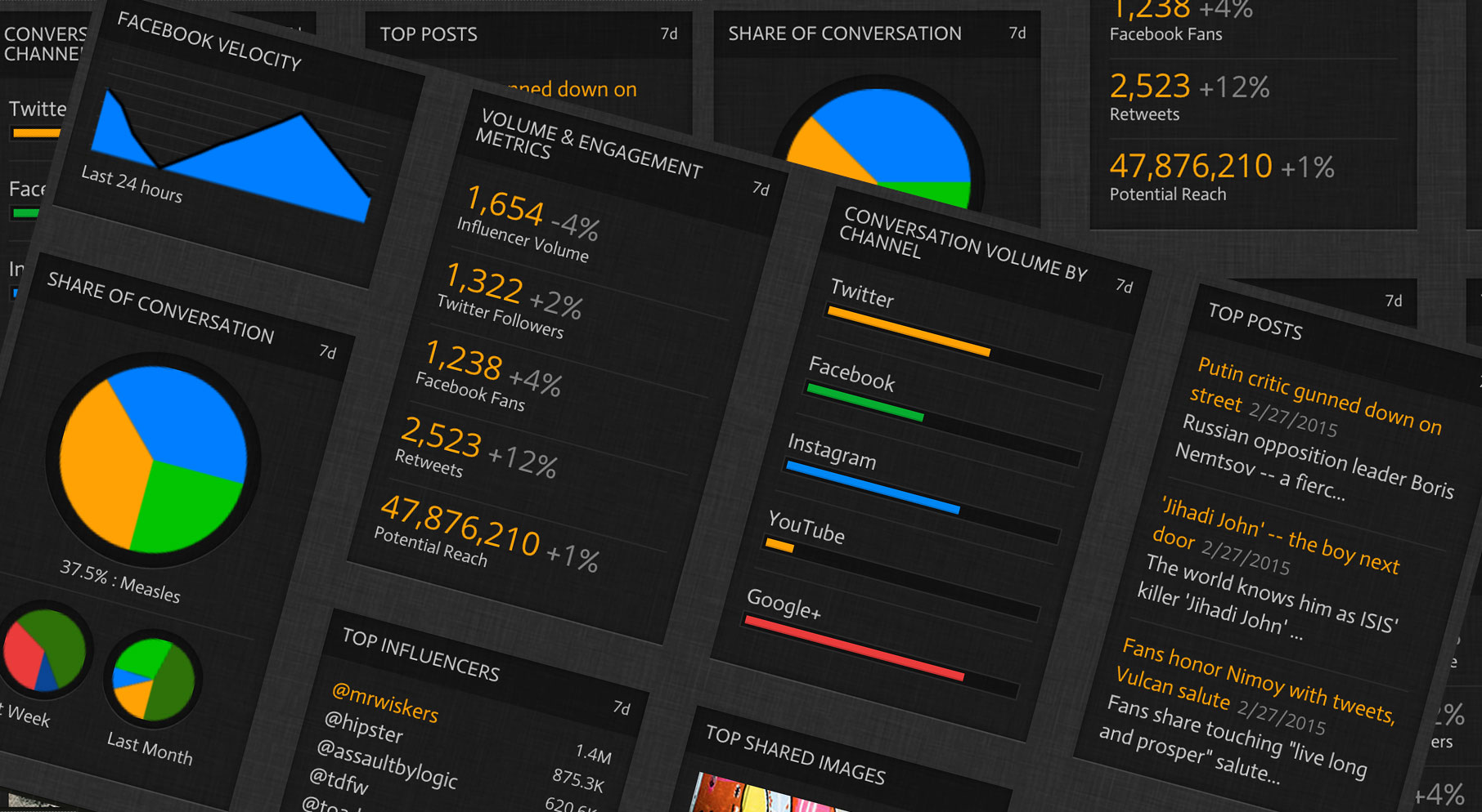
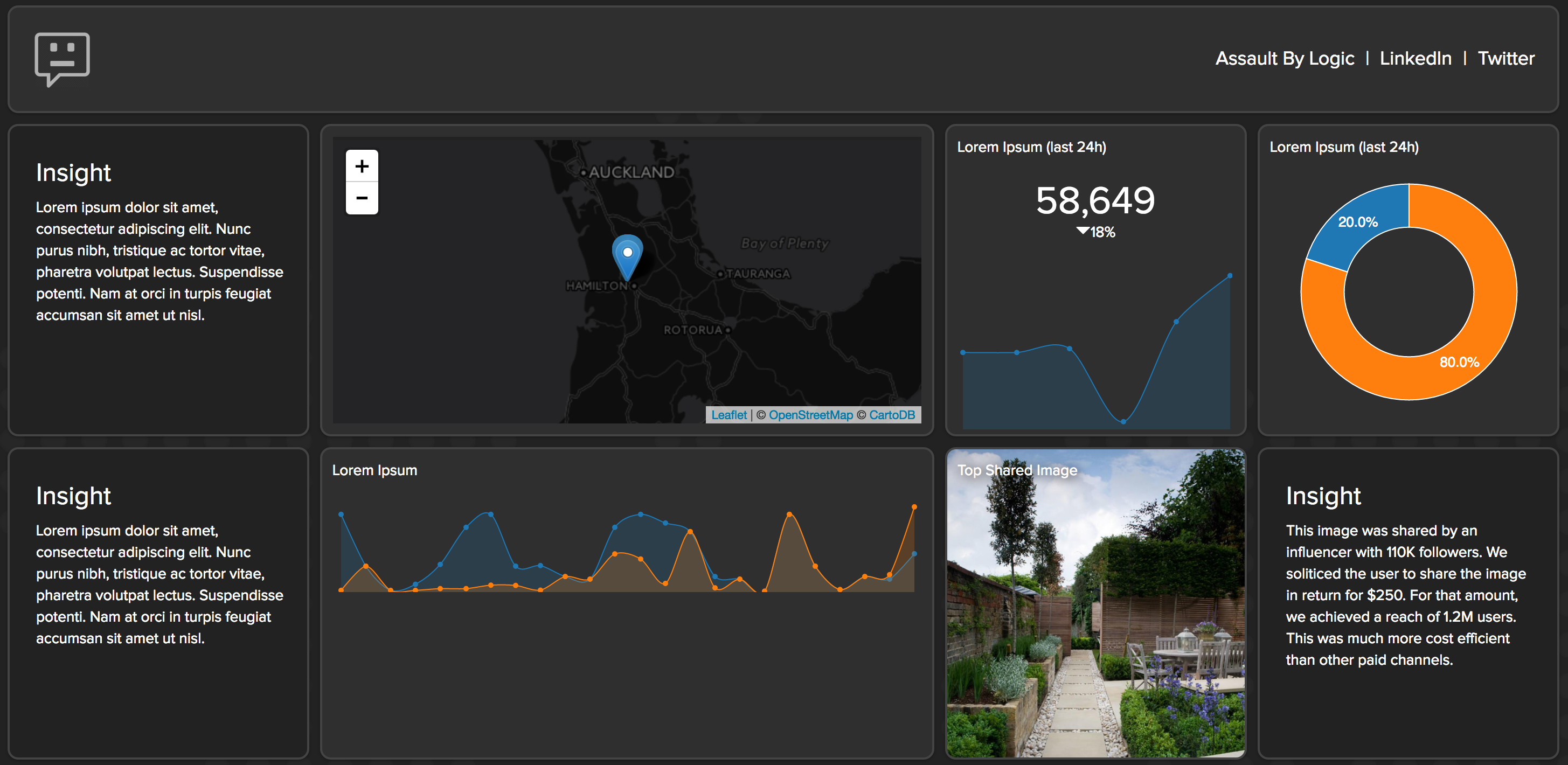
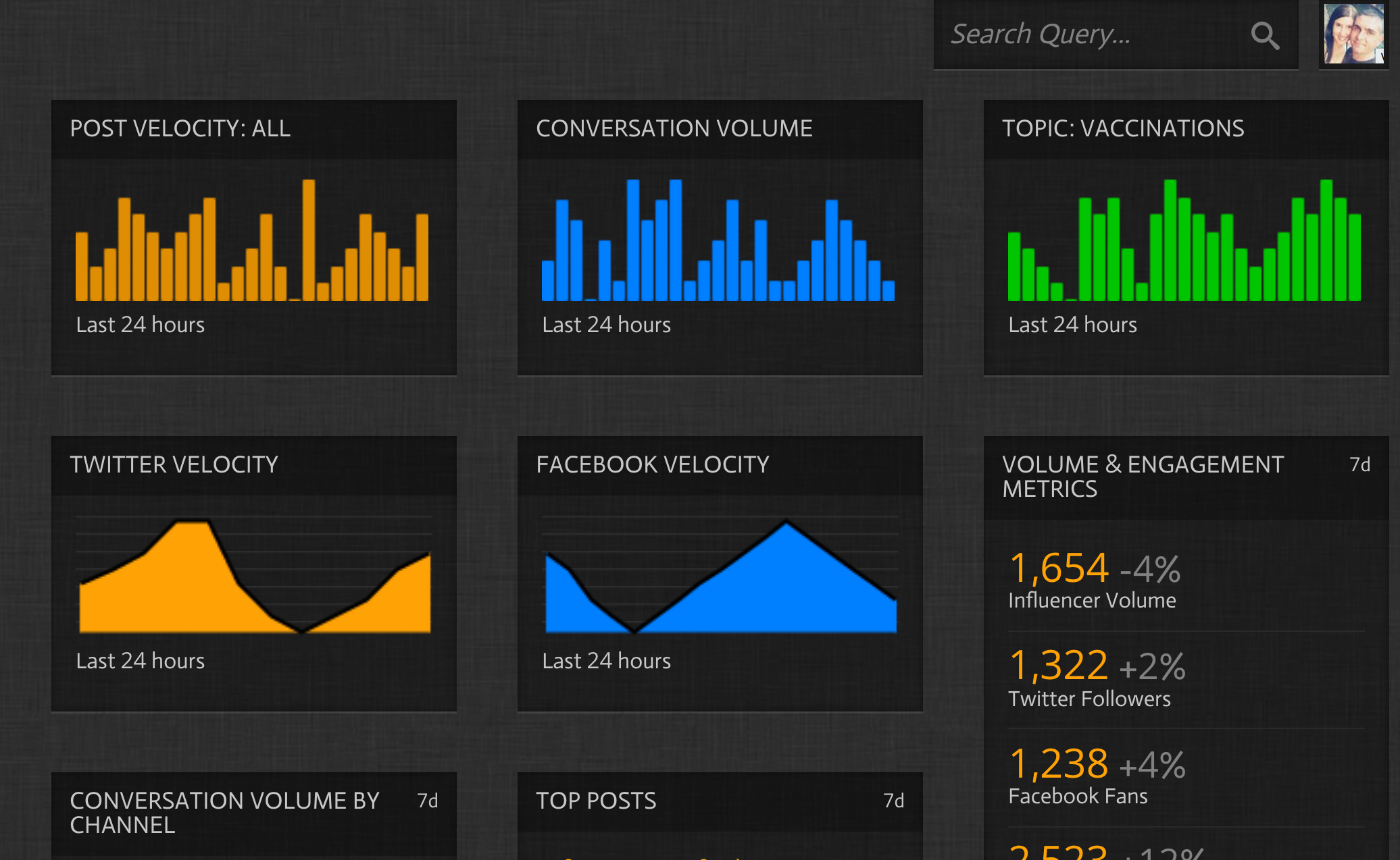
An important part of every visualization is also consistency across multiple data views. For example, if you are like me, you build visualizations that live in the social space. Semantic colors for social media properties are found in the graphic below:
Here are two examples of charts, one using semantic color to frame the context, and one without.
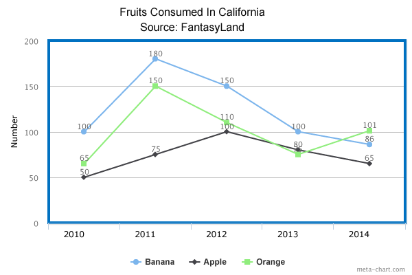
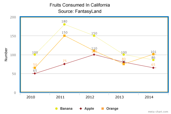
If you have 20 charts that are all displaying similar content but organized in a way to tell a story, you want the message to be the story and not have the user searching for context or saying “What does this line represent?” Having a representation of consistent colors that span all your visualizations adds to the continuity of your application and helps to quickly provide context. If used correctly too, you can enhance the user experience by limiting the need for legends or other identifying or instructional functionality.
