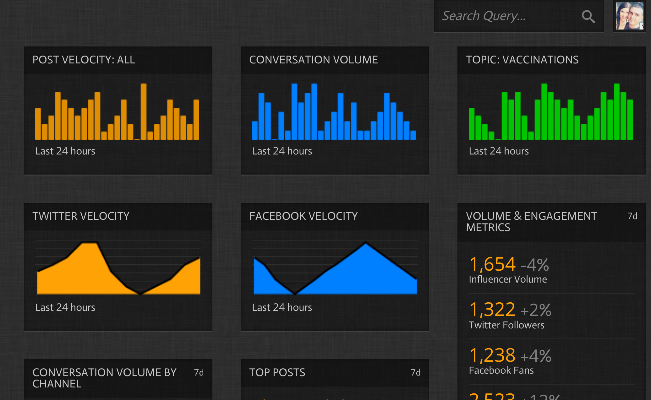
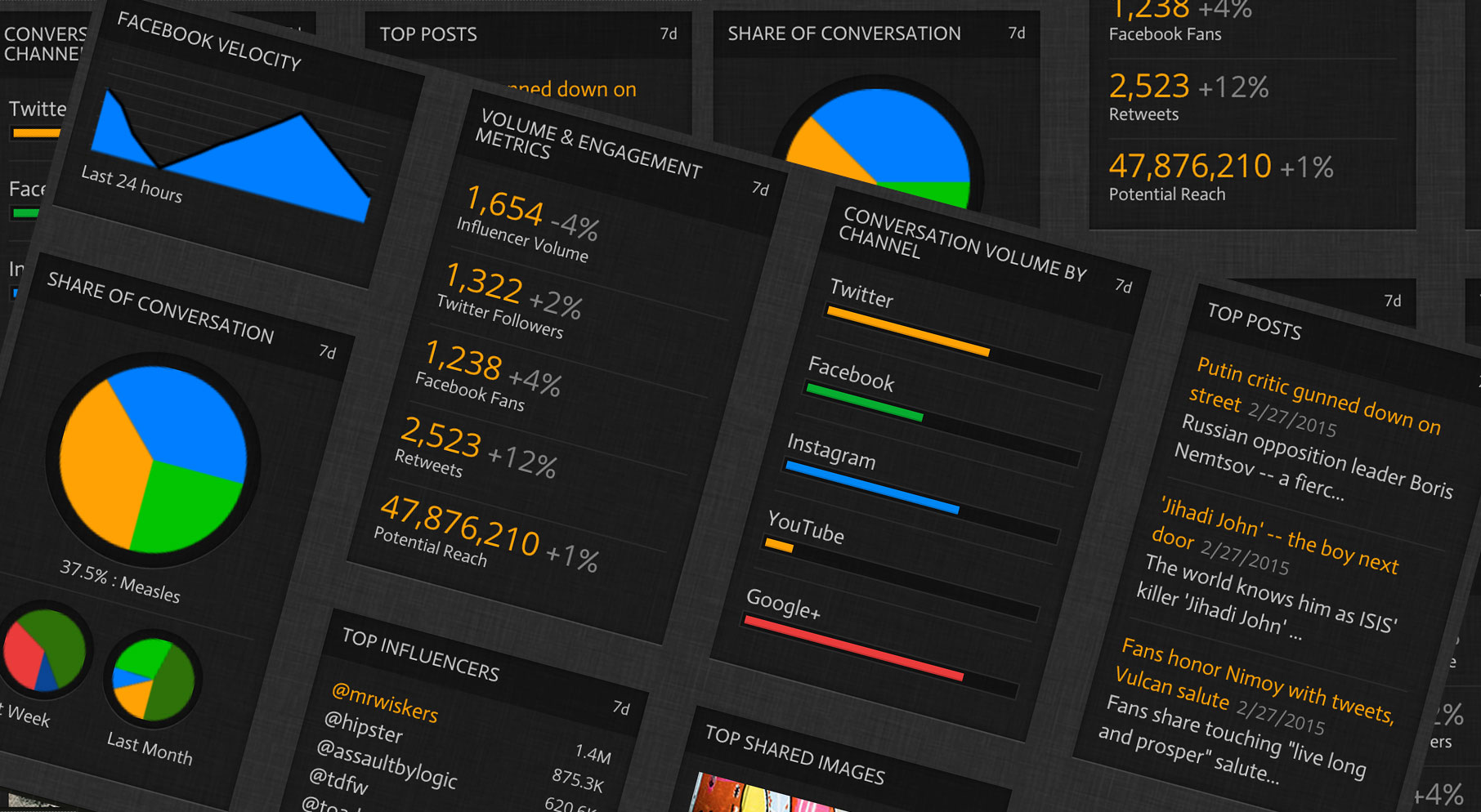
Dashboard development has become novel in the last 5 years. Everyone has a dashboard that is branded “easy”, “intuitive” or “custom”. I have interactions with clients and the number one…
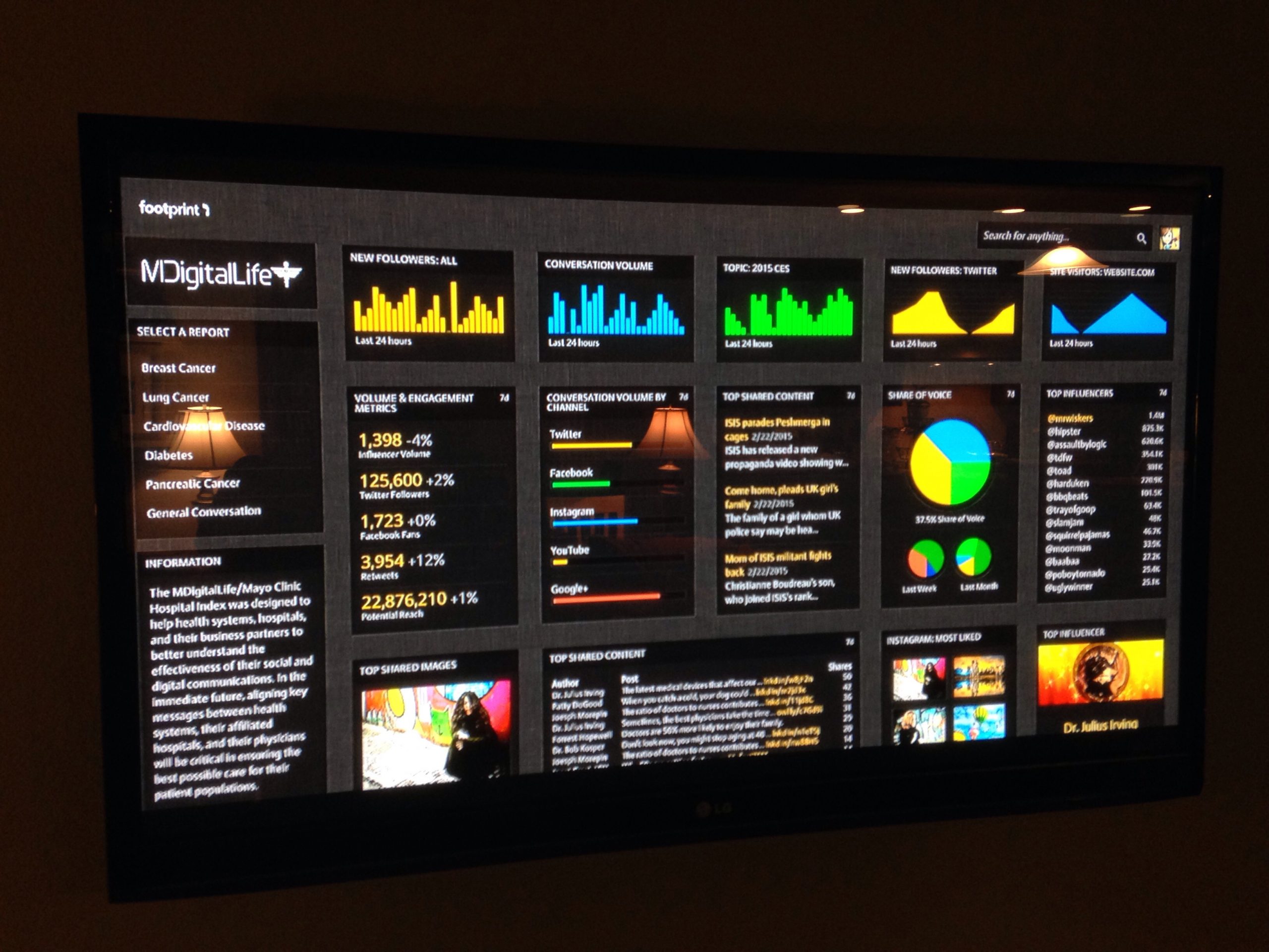
A new era of intelligent, lightweight ‘dashboards’
Dashboard development has become novel in the last 5 years. Everyone has a dashboard that is branded “easy”, “intuitive” or “custom”. I have interactions with clients and the number one question I get is “What will this do for ME?” It got me thinking.

In today’s data-centric society, we tend to focus our efforts around ingesting and displaying data in a unified interface. We plan, we get the issues that people are trying to solve and we build “dashboards” that display this data. We focus on ways to make the data faster, more intuitive and aesthetically pleasing. Great.
Great? I still haven’t answer the question. What will this application do for my user? So, that brings me to where I am now. We should be asking ourselves the following. Who are the users of the application? How do we build, not just one interface, but many interfaces that target ‘who’ and are flexible enough to change when new types of users are introduced. Within the same data set, different users will need to answer different questions and need that information displayed in different formats.
Interfaces should be built around users, not around data.
User Examples
An analyst will want to rely heavily on a business intelligence tool to build reports that answer specific questions or, ideally identify the questions/issues. They need detailed control over the configuration.
Once an analyst builds the first level reports, the brand managers will play in that sandbox. A brand manager will want to be able to manipulate the data to discover emerging trends and then build high level reports.
CMO’s typically want to see data at a high level organized in a simple, easy to read interface. The data has to be organized for quick knowledge transfer.
Separating Interface From Data
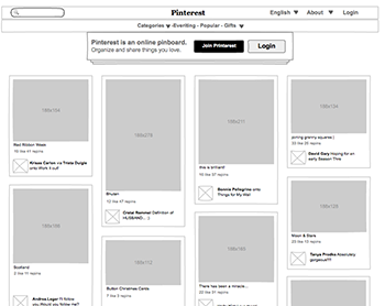 The ability to build interfaces that are flexible and are not dependent on the data is important. It can be thought of like a wall socket. Each interface should be able to “plug-in” to the data in such a way that new interfaces can be developed quickly or, in the optimal situation, created by the users without development. Once you integrate the two, it is like driving an 18-wheeler down a highway. It can be really difficult to turn. What you need is smaller, lightweight interfaces that are data independent.
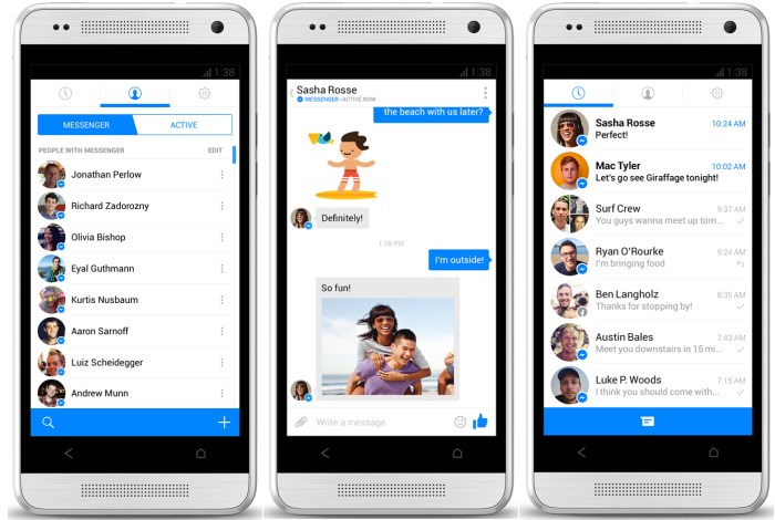
You are starting to see companies build in this way. As an example, Facebook recently broke off their “Messenger” application. The reason was simple. Instead of a unified interface, they can develop both platform interfaces separate and independent of the data and be able to change things up quickly.
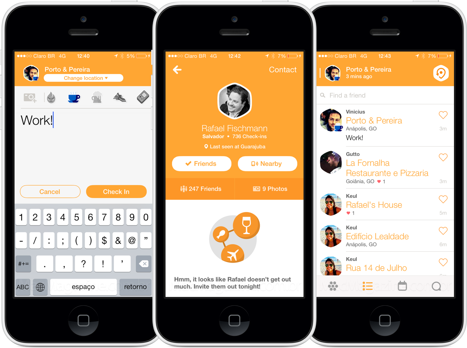
Another example is Foursquare and their recent decision to split off “Swarm”. It was a feature of the main foursquare app that was split out because they could evolve it (or kill it) without it being highly integrated into the main application. It is becoming a common trend.
What is next?
Lighter, more flexible “dashboard” interfaces with specific use cases will be common. Attention spans and market windows are getting shorter and technology evolution is not slowing down. In 2015, I see a trend of single purpose application interfaces that make use of public/private APIs (What is an API?) to do very specific tasks. Especially in the enterprise space. Tying social or public data to internal data systems will be more critical than ever.
The era of building expensive, complex business intelligence applications is coming to an end. The short attention spans of the average users are demanding more focused application development. Users are fickle. What they want today, they may not want in 3-6 months. We need to develop applications that can adjust to the market and solve user specific problems.

