Chances are, you have used Amazon.com, purchased many things, or watched Prime movies over the last few years. The amazon.com site has changed over the years, but the user experience…

New compact UX for amazon.com
UX: Why is Amazon so bad at user experience?
-
- 0 Comments
- 4 min
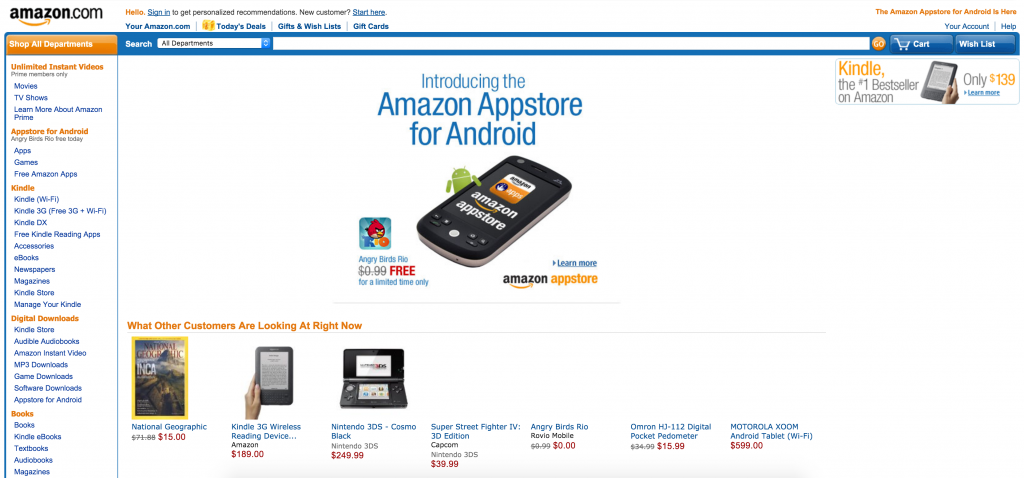
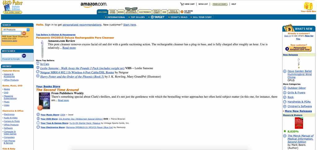
Chances are, you have used Amazon.com, purchased many things, or watched Prime movies over the last few years. The amazon.com site has changed over the years, but the user experience hasn’t gotten any better. The site began in 1995 and quickly became a go to for books, and online purchases. But when it comes to user experience, they miss the mark completely. The sites early on were actually on par with the experiences of the time but they haven’t evolved much since.
Jeff Bezos, CEO of Amazon, hired Larry Tesler, Apple’s Chief Scientist and never took any of his suggestions in regards to online experience. Probably what prompted Tesler leaving after 3 years.
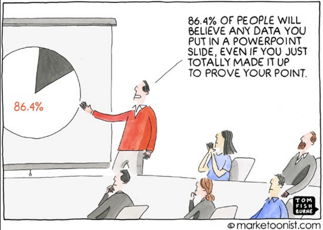
As long as sales are strong and competition is weak, it appears that Amazon doesn’t want to change. I do not have any site statistics to go on to know what the click through ratings are. If I had that information, I would be able to discern, with better accuracy, the prioritization of the items on the page. I can say that if you look at the pages of Amazon.com, it is still stuck in the 90s. The layout is stuffed with items that are not prioritized by my preferences. Sure, the products and services are tailored but how many of those areas do I really actually look at and click on? It is more of a general approach to layout and if today’s standards and best practices tell us anything about users is that less is more. You have to be creative with space, not shove tons of content and overwhelm the user.
Prioritization
As a user of Amazon.com we have to understand the primary goal of a user. Once you determine that, it is much easier to give them a layout and learn to guide them to the goal. You start with a set default layout and then the site should learn over time what is most important to a user, always balancing with advertising space as well as upsell or promotional items. It is also important to use high value real estate on the page to lead the eye through the page. The top-center and top-right are first seen and generally hold the most value if you have a clean, user centric design. Those areas should be reserved for highest value ads and campaigns or promotions. Your clicks will be 2-3 times higher in those spaces if your ads are compelling and simple.
CTA (Calls-To-Action)
A site like Amazon.com should have plenty of these. CTA’s should exist within all spaces. The current Amazon.com site has lots of these but it is so messy and disorganized that they get lost. Foe example, the products exist in space instead of being cards or full-image links. With today’s trends, products should be more enticing to click.
Stacked Content (Mobile UX)
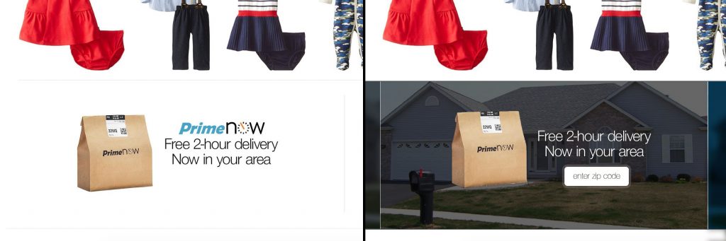
With more than 50% of traffic on sites now coming from mobile, product managers and user experience designers should always be aware and design for that experience in addition to standard desktop experiences. if you look at Amazon.com, the experience is actually much better on mobile than desktop but it is a completely different site and it does’t have to be. Identifying experiences based on entry point is essential. It isn’t just about platform, you should always consider what a user wants to see in addition to the device they are on.
Take the current Amazon.com UX layout:
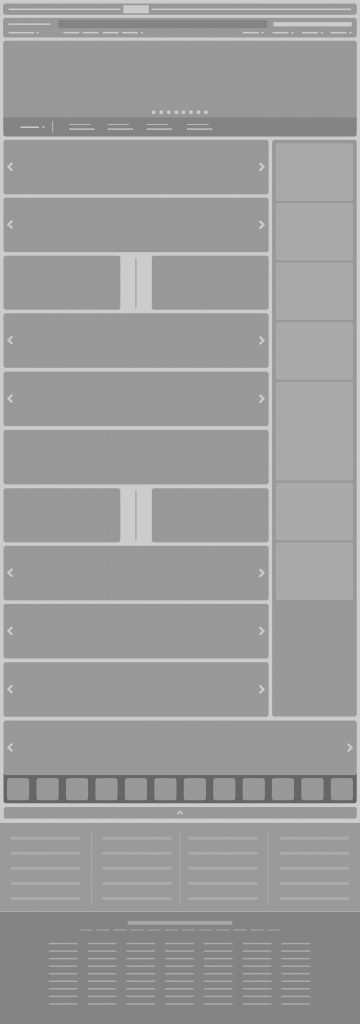
Page is way too long and has so much going on, the wireframes do not really show all the stuff that is happening. I would be anxious to see how many users actually scroll past the first quarter of the page. My guess is not too many. The entry point is the navigation that filters what the user wants to see. That should be the point of focus for the site.
Here is a possible wireframe for a new user experience for amazon.com. It maps to the key areas of the page, is on a mobile 12-column grid and makes use of some creative navigation elements.
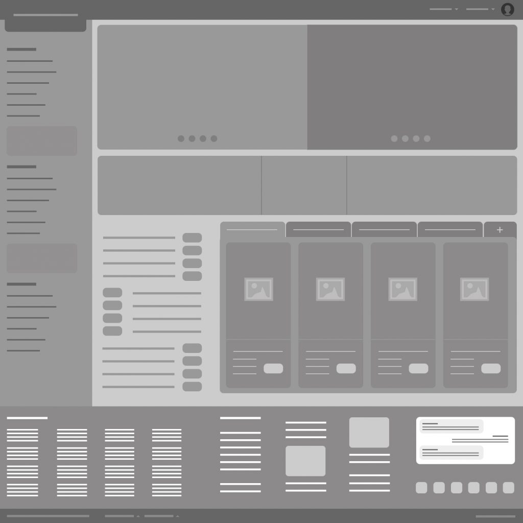
First, adjusting the hero to become the focal point of the page. But splitting into 2, you could create a separation of the feature areas. Also an option would be to make the left scrolling area span 1 column more than the right creating a true primary focus. The thought here is that with 2 areas, 2 major categories could be given prominence. Over time, you could train the page to know what is most important to the user or use the right area there to promote items the user doesn’t tend to look at.
The side navigation would become cleaner and broken into areas separated by images that promote the categories. You could still use the drop downs in those to expand out to more specific items. Might also be interesting to give the user the ability to control some of this. If you had statistics around the page views, you could analyze the highly traffic pages and adjust over time.
The central area could have a 3 column ad/product campaign space that could be used for items that are frequency capped, items that only show to a specific user for a given amount of time. The items here are important enough to give high prominence so if these are compelling, they will be high traffic items.
Under that area, to the left is an internal navigation area to items that may have daily or seasonal significance. It breaks up the space and helps to lead the eye through the page. To the right of that, is a tabbed area that has products in four categories that uses horizontal infinite scroll. You can also add more categories to personalize the experience.
In the footer, the list of countries are in the first column (spans 40% of the row). As an added feature, this country/language selection should also be one of the dropdowns at the top right of the page, next to the profile icon. As you move from left to right, you can use the next 3 columns to add reviews for previous products you have viewed but not purchased. The last column would be a live chat feature with social media links below that for engagement with Amazon products, services or support.
This is just a basic idea of some changes that could help increase traffic control to the more profitable and user-specific areas of the site. But UX should not be done without analyzing the site statistics and understanding the business objectives. My wireframe is based on some best practices that amazon.com doesn’t currently follow. It is overwhelming and could be simplified in order to provide the key component necessary for continued success, personalization. Without keeping the user in mind, the site really loses it’s ability to drive sales at the individual level. Without it, it is just the site that people who know what they want come to purchase. Sites should focus on ease of use, user personalization and content prioritization.