I cringe when I see beautiful maps, charts and graphs that provide no value. For a truly valuable visualization, you need to make sure you account for the aspects that…
5 things every visualization should have
-
- 3 min
I cringe when I see beautiful maps, charts and graphs that provide no value. For a truly valuable visualization, you need to make sure you account for the aspects that not only make it beautiful, but more importantly usable for making good business decisions. Like so many others, i started out only building what looked good without thinking of how it could be used for business purpose. Ive made a list of the five things that should always be considered when building dashboards or visualizations.
Purpose
Every visualization should have a purpose. The purpose could be marketing, analysis, reporting (WITH INSIGHTS, cannot stress that enough) or something else that uses visual data to perform a business function. You should treat a visualization like a product feature. Write a problem statement, the solution and what problem oriented features does the visualization solve.
The purpose should provide business value above and beyond a simple, “to show the value of x”. Be descriptive. Something like: “By showing the number of widgets sold over the last n days, we can compare that to the previous similar time period to determine if the marketing campaigns we are running are having a positive effect on sales.”
Scale
One of the quickest ways to render a visualization useless is to not be able to optically scan it for scale. Scale is usually synonymous with volume. Scale is a priority for items like bar, line, and area charts. For items like scatterplots, scale is usually a 3rd axis of size of a point. It is equally important as distribution. The one thing to remember about scale is that as you mature in visualization creation, you will realize that scale and distribution are inherently linked and bar and line charts are good when the data is more normalized. The bigger the volume of data, the more useful a box plot would be to understand the distribution.
Reference
Points of reference are essential, especially if the data is not very well understood. If i showed you this chart and said “Look at our sales, we sold 250K units this month!”
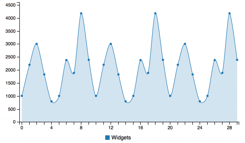
Pat on the back right? Well, what if my next question was, “How does that compare to last month?” or “What was the year over year growth for the same period?”. Well, let’s take a look and see what the chart means when we add data from the same time last year.
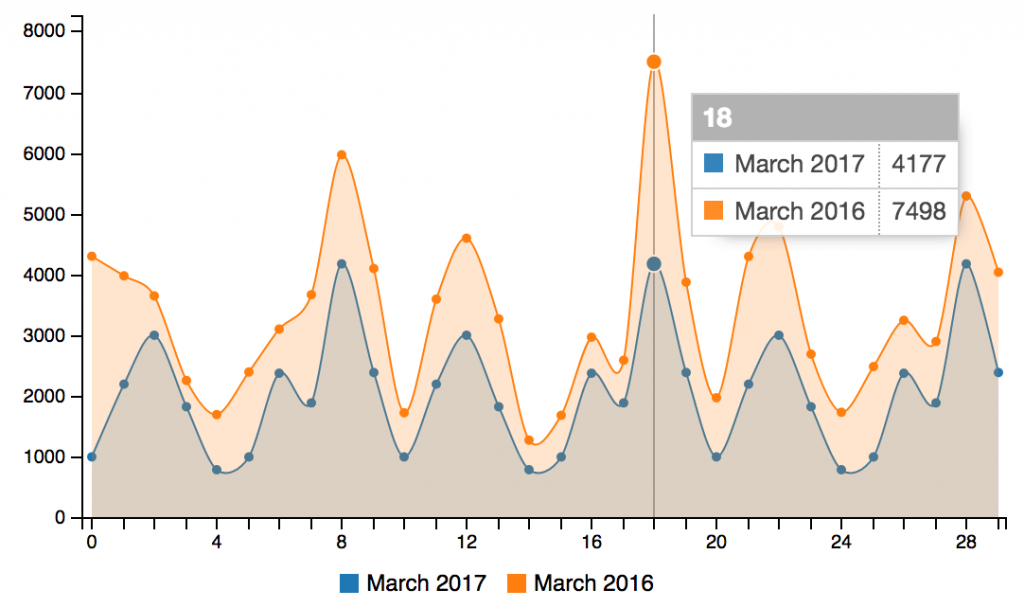
As you can see, it tells a completely different story. Business decisions will be much different given this added context. Always make sure you give your audience the right frame of reference to understand the data.
Balance
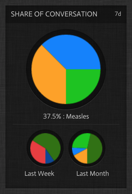
Making sure your charts have balance is an often overlooked component but one that could make sure users are comfortable and engaged. Simply put, balancing text insights with a visual component helps to give the full impact to the object. A quick scan of the visualization and a quick insight will frame the solution and ensure that its not just useful for analysts.
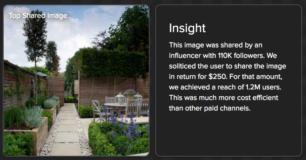
Showing the insights that accompany a chart balance out the visual with context. Whenever possible, you should always include it.
Relativity
Relativity is very similar to reference in that 2 values are tied together. The biggest difference is that reference is for comparison whereas relativity infers dependency. For example, you could look at number of web sales relative to total site visitors (ratio). In this example, the direct impact is web sales but the 2 are directly related. Web sales over time would be more of a reference. Relativity is exposed in dimensional analytics like this.
—————————-
Building visualizations is easy but building relevant and useful visualizations is much harder. It requires planning and an understanding of the data. Remember, analytics is storytelling, not reporting.